Explore Goodreads data: my most read authors
-1517355.jpg)
Photo by Nubia Navarro (nubikini) from Pexels
Whether a side project or a hobby, it feels like we are all spending time learning new things outside of working hours… I’m trying to get familiar with Python. One day it dawned on me that maybe I can use my new knowledge with Goodreads.
Get the data#
First, export the information of books from Goodreads.
Log in to Goodreads, go to My Books > Tools, and select Import and Export.
Select Export Library.
When finished, a link will appear under the export button. Click the link to download the exported library file. The filename is
goodreads_library_export.csv.
Prepare the data#
Next, get all of that data into a Pandas DataFrame.
from matplotlib import pyplot as plt
import numpy as np
import pandas as pd

books = pd.read_csv("goodreads_library_export.csv")
Some columns/features are not very interesting, let’s remove them.
books.drop(columns=["Book Id", "Author l-f", "Additional Authors", "ISBN", "ISBN13", "Bookshelves", "Bookshelves with positions", "Read Count", "Private Notes", "My Review", "Spoiler", "Recommended For", "Recommended By", "Owned Copies", "Original Purchase Location", "Original Purchase Date", "Condition", "Condition Description", "BCID"], inplace=True)
Get back the most read authors#
About three years ago Goodreads decided to take down a feature called Most Read Authors (you can read more about it here). I’m among those who want this feature back. Now that I have (almost) all the data, I do not need to wait for the Goodreads product team to make that happen!
Books in the Goodreads library have three statuses: Read, Want to read, and Currently reading. I only want to check the books I have finished.
# make a subset of finished books
books_read = books[(books['Exclusive Shelf'] == 'read')]

# Count the occurences of authors in the dataset, extract the value names (authors) and counts into two lists
authors_list = books_read['Author'].value_counts().index.tolist()
authors_count = books_read['Author'].value_counts().values.tolist()

# Get top 10 authors
top10_authors = authors_list[:10]
top10_authors_count = authors_count[:10]
Horizontal bar chart#
If staying with the conventional vertical bar chart, we’ll have a chart like below:
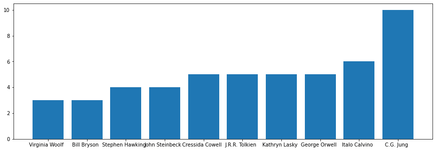
Not very exciting, right?
A good book about data visualization is Stroytelling with data. Among the many topics it covers, there is one about choosing an effective visual. It convinced me that I’ll be better off with a horizontal bar chart. And I need to declutter (remove noises) the chart as much as possible.
After a lot of trial and error, copy-paste from stackoverflow, and read matplotlib and Python documentation (yeah, we do need to read the documentation!) I got a horizontal bar chart.
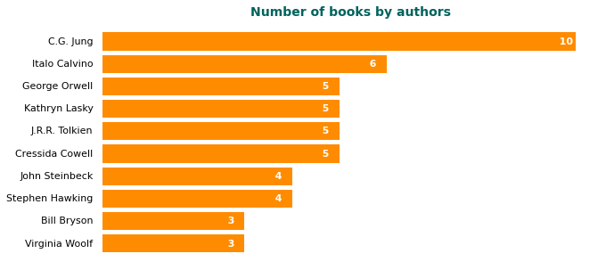
Would you like this new one better?
Here are the tricks.
# Declutter: remove chart borders
ax.spines['right'].set_visible(False)
ax.spines['top'].set_visible(False)
ax.spines['left'].set_visible(False)
ax.spines['bottom'].set_visible(False)

# Declutter: clean up axies

# Hide the whole x-axis, including axis ticks, axis tick labels, and axis
ax.axes.xaxis.set_visible(False)
# Hide the y-axis ticks but keep tick labels
ax.tick_params(axis='y', length=0)

# Put number next to each bar. If you want the number to appear at the leftmost end, replave "v-0.5" with "0"
for i, v in enumerate(y):
    plt.text(v-0.5, i, "  "+str(v), color='white', va='center', size=11, fontweight='bold')
Are they really my favorite authors?#
Seeing that Jung is atop my list makes me want to admire myself 😉, but why I have so many authors famous for children’s books or young adults? A plausible explanation is that I read them for my kid when he was small or when I was young.
Maybe it makes sense to chart the years in which I read them.
I guess I need a scatter plot for this purpose. Though it turns out more complicated than I first thought (or more likely it just proves that I still have a long way to go …). Anyway, let’s start working, or charting.
Scatter plot#
Begin with making another subset.
# Get a subset of the book library with only the top authors
top10_authors_lib = books_read.loc[books_read['Author'].isin(top10_authors)]

# Order the library
sorted_lib = top10_authors_lib.sort_values(by=['Date Read'])

# Add a new column
sorted_lib['Year Read'] = pd.DatetimeIndex(sorted_lib['Date Read']).year

# Remove rows with missing values
sorted_lib.dropna(inplace=True)
Prepare the canvas and data.
# Prepare the scatterplot
fig2, ax2 = plt.subplots(figsize=(14,5))

x = sorted_lib['Year Read'].tolist()
y = sorted_lib['Author'].tolist()

x = [str(item).replace('.0', '') for item in x]

# Set title
plt.title('Authors read in the year', pad=20, weight='bold', size=14, color='#00635d')
Declutter.
# Declutter: remove chart borders
ax2.spines['left'].set_visible(False)
ax2.spines['right'].set_visible(False)
ax2.spines['top'].set_visible(False)

ax2.tick_params(axis='y', length=0, labelsize=11)
Show me the chart!
plt.scatter(x, y, color="#FF8C00")
plt.grid(axis = 'y', color = 'lightgrey', linestyle = '--', linewidth = 0.5)

plt.show()
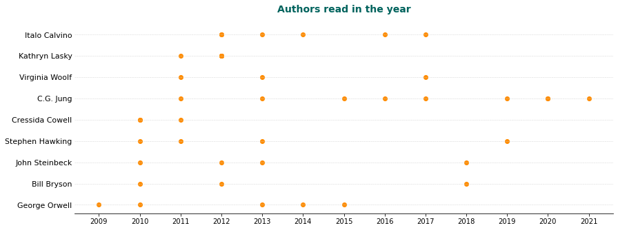
It’s reassuring to see my interest in some authors lasts longer than others.
In closing#
While trying this small project, I began to have more ideas about questions to which I want to find an aswer. There is so much hidden information in the data.
If you are interested to see all the detail of my experimentation with Goodreads data, have a look at my Github repo. Maybe you can help me to improve it or devise new applications!